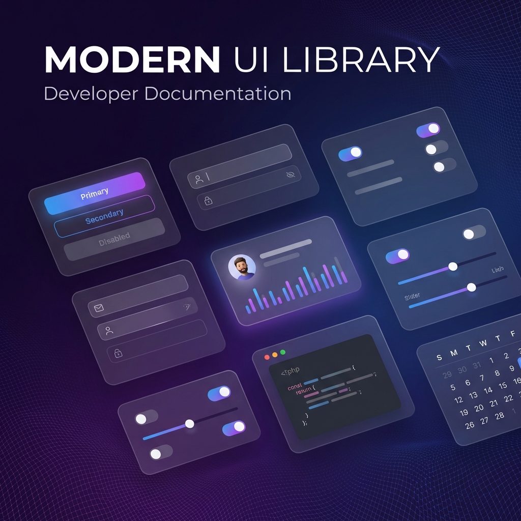
Everything You Need to Build Modern Apps
Built with modern best practices and designed for developer experience. From buttons to complex data grids, X-UI has you covered.
Beautiful Design
Glassmorphism, gradients, and micro-animations create stunning visual experiences.
Dark Mode First
Built with dark mode as the default, with seamless light mode support.
Responsive
Works beautifully on all screen sizes from mobile to desktop.
Accessible
WCAG 2.1 AA compliant with full keyboard navigation and screen reader support.
AI-Powered
Native MCP server integration for intelligent, context-aware component generation.
Blazing Fast
Tree-shakable, optimized bundle under 50kb. No performance compromise.
TypeScript First
Built entirely in TypeScript with full type definitions and IntelliSense support.
Cross Platform
Unified API for React and React Native. Build once, deploy everywhere.
Your Personal
AI Design Assistant
Stop switching contexts. X-UI comes with a powerful Model Context Protocol (MCP) server that connects your codebase directly to LLMs like Claude and Gemini.
Context-Aware Generation
The AI understands your design system, tokens, and existing components to generate perfectly matching code.
Zero-Shot Accuracy
Get production-ready components in a single prompt, fully typed and accessible, without manual adjustments.
Design System Sync
Automatically adheres to your project's color tokens, typography, and spacing variables.
GlassCard component you requested:import { Card, Button, Avatar } from '@xdev-asia/x-ui-react';
export default function UserDetails() {
return (
<Card variant="glass" padding="lg">
<div className="flex items-center gap-4">
<Avatar src="/user.png" size="lg" />
<div>
<h3>Sarah Connor</h3>
<Button variant="gradient">Follow</Button>
</div>
</div>
</Card>
);
}Component Showcase
Interact with our comprehensive library of 50+ professionally crafted components.
Cards